Contact Form vs WhatsApp Button
If your goal is more leads, a WhatsApp button usually wins for speed and first contact, while a contact form wins for detailed enquiries and cleaner qualification. Most small business sites should not force a hard choice. Use WhatsApp for fast questions and keep the form for longer requests, quotes, or fallback.
This guide is for business owners, agencies, freelancers, and website managers who need a practical decision instead of generic advice. You will see which option fits each intent, how to place both, and how to avoid making them compete on the same page.
Quick answer
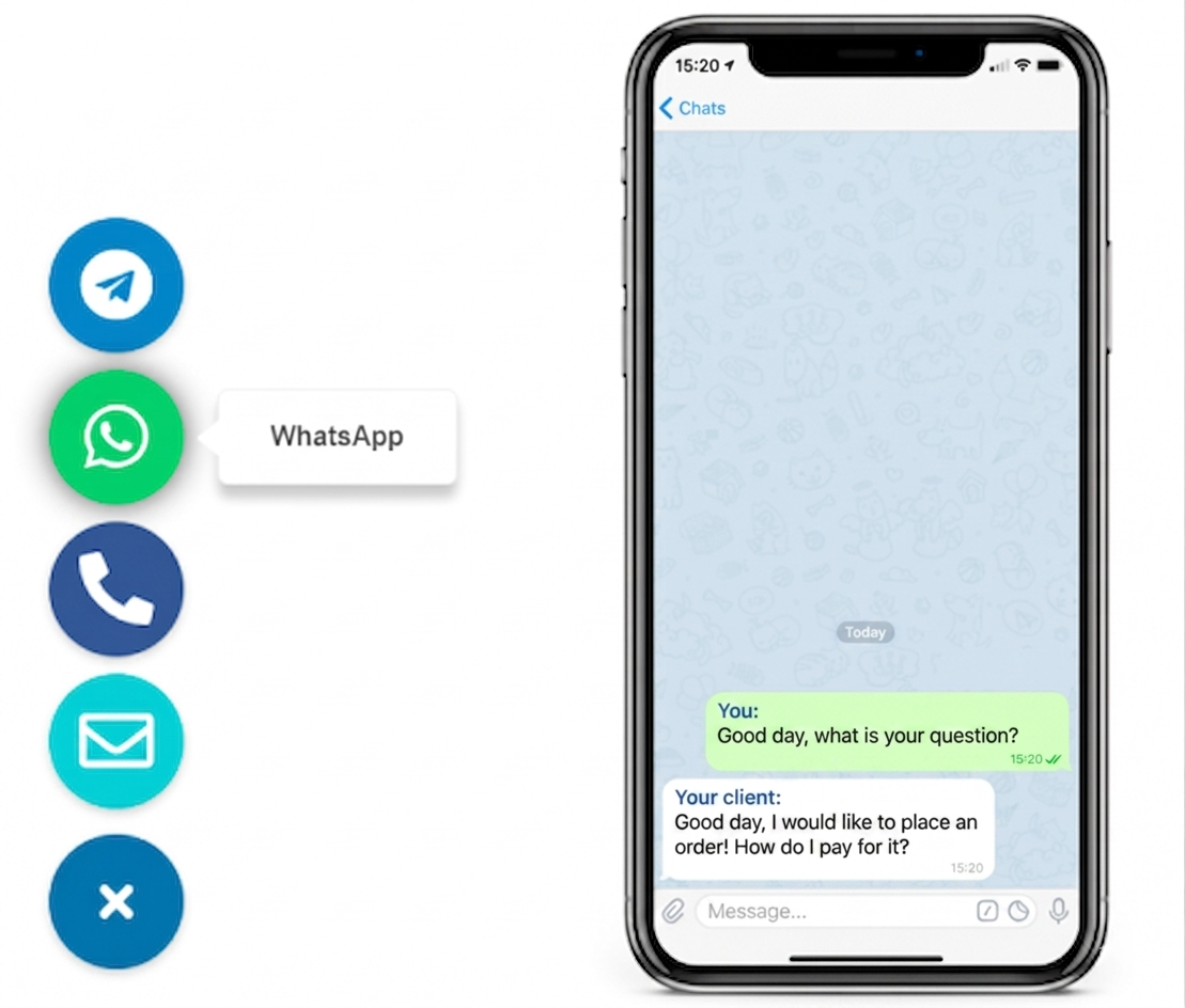
- Choose WhatsApp for fast pre-sale questions and lower friction.
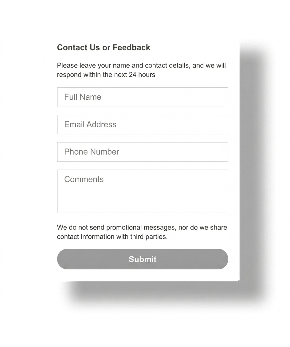
- Choose a form for structured requests, longer details, and attachments.
- Keep both when your website serves mixed-intent visitors.
- Do not let the floating button hide the form or your main CTA.
Why this matters
Can you use a contact form and a WhatsApp button without coding?
How to set up both without making them compete
- Decide which pages need quick messaging and which need structured detail.
- Keep the contact form on the contact page and other high-detail pages.
- Add one floating WhatsApp button for quick pre-sale or support-style questions.
- Write the form CTA for detailed requests and the WhatsApp CTA for fast questions.
- Test mobile spacing so the button never covers the form submit button.
- Review which path gets better enquiries, not just more clicks.
Who should keep both
- Service businesses that get both quick questions and long quote requests.
- Agencies that need discovery details but still want faster first contact.
- Local businesses where mobile visitors often prefer messaging first.
- Sites that want a fallback for visitors who do not use WhatsApp.
If your site depends heavily on one messenger, compare this page with WhatsApp Button for Website. If you want broader multi-channel guidance, read How to Add Messenger Buttons to Website.
Platform-specific guidance
- WordPress: do not let the button overlap the form or sticky mobile menu.
- Shopify and Wix: test on conversion pages first.
- Webflow and Joomla: keep the button global and the form contextual.
- HTML sites: avoid duplicating the same button on every page manually.
Placement and UX guidance
1
Use WhatsApp for fast intent
Place the button where mobile visitors can reach it quickly on service, pricing, or product pages.
2
Keep the form for detail
Let the contact form handle project scope, budget, attachments, or longer explanations that do not fit a chat-first flow.
3
Prevent overlap
The floating button should never block the form submit area, sticky buy bars, cookie banners, or key navigation on mobile.
Contact form vs WhatsApp button at a glance
| Decision point | Contact form | WhatsApp button |
|---|---|---|
| Best for | Detailed enquiries, quotes, and structured qualification. | Quick questions, low-friction first contact, and mobile-friendly outreach. |
| Lead quality | Usually fewer but more detailed submissions. | Usually more conversations, but some will be less qualified. |
| User effort | Higher effort because the visitor must type more before sending. | Lower effort because the visitor enters a familiar chat flow quickly. |
| Page placement | Best on contact, quote, and project detail pages. | Best as a floating or persistent contact action on high-intent pages. |
| When to prefer it | When you need context before replying. | When speed and accessibility matter more than structured intake. |
Should you choose one or keep both?
Common mistakes
Making both CTAs identical
If the form and WhatsApp button promise the same thing in the same place, visitors hesitate instead of choosing the right path.
Letting the button cover the form
A floating button that blocks the form submit area destroys the exact fallback path you meant to protect.
Measuring clicks instead of lead quality
More chats do not always mean better leads. Compare outcome quality, not just interaction volume.
Removing the fallback too early
Some visitors do not use WhatsApp at all. Keep the form available where detail and privacy still matter.
- Use WhatsApp for speed and the form for structured detail.
- Keep the two CTAs distinct so visitors know which path to use.
- Test mobile overlap with sticky bars, cookie banners, and submit buttons.
- Review lead quality, not only raw chat or form volume.
- Keep a fallback contact method for visitors who do not use WhatsApp.
Frequently asked questions about contact form vs WhatsApp button
Contact form vs WhatsApp button: which gets more leads?
A WhatsApp button usually gets more quick conversations, while a contact form usually gets more detailed enquiries. The better lead source depends on how complex your offer is and how much information you need before replying.
Can I use a contact form and a WhatsApp button together without coding?
Yes. Many sites keep the contact form in the normal page builder and add a WhatsApp button through one hosted script or widget.
Will a WhatsApp button work on mobile and desktop?
Yes, if you test both layouts. The button should stay visible without covering sticky navigation, checkout bars, or the form submit area.
Should I use a plugin, script, or built-in form tool?
Use the cleanest path your platform supports. A script-based button is usually lighter, while the form can remain in your built-in CMS or page-builder tool.
Is a contact form better than a WhatsApp button for complex enquiries?
Usually yes. A form is better when the visitor needs to send project scope, budget, scheduling detail, or a longer message before the first reply.
Should I choose one contact method or keep both?
Most small business sites should keep both. Let WhatsApp handle fast questions and keep the form for more detailed or email-first leads.
Want the faster path without removing your form?
Launch a WhatsApp button as the quick-contact layer, keep your contact form as the detailed fallback, and test which path converts better on real pages.