How Small Businesses Can Get More Website Leads With Messenger Buttons
Small businesses get more website leads with messenger buttons when the button offers one fast contact path, stays visible on high-intent pages, and removes the friction of long forms or delayed callbacks. The goal is not to add more UI. It is to help visitors start the first conversation before they leave the page.
This guide is for owners, local service teams, freelancers, and agencies that want a clearer path from page visit to first message. You will see what kind of setup works, where the button should appear, which platforms are easiest to manage, and when to keep a form as backup.
Quick answer
- Put messenger buttons on pages where visitors are close to asking, booking, or buying.
- Keep the first action simple: one button, one expected outcome, one clear message route.
- Use a form as fallback for longer requests, not as the only path for every visitor.
- Test mobile spacing before you publish because poor placement can lower clicks.
Why messenger buttons can improve lead flow
Can you do this without coding?
Step by step: how to get more leads with messenger buttons
- Choose one primary contact goal such as fast questions, quote requests, or local booking enquiries.
- Pick the messenger channel or channel mix your audience already uses.
- Add the button on high-intent pages instead of hiding it only on the contact page.
- Write CTA copy that promises a fast first reply, not a vague generic chat.
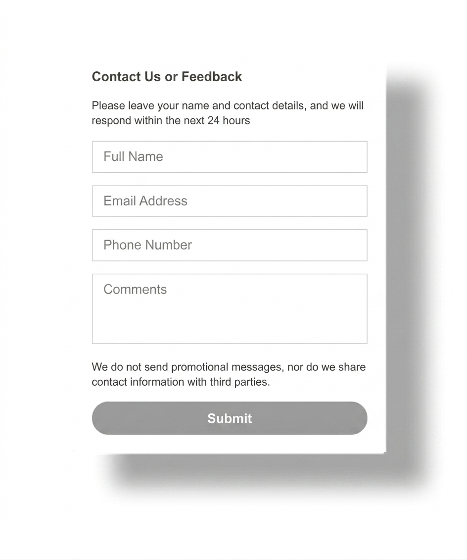
- Keep a contact form available for long requests, attachments, or after-hours detail.
- Test the final behavior on mobile and desktop before publishing.
Who this works best for
- Local businesses that get quick pre-sale questions from mobile visitors.
- Freelancers and agencies that want faster first contact before a full brief.
- Service companies whose visitors hesitate before filling a long form.
- Small teams that need a simpler lead path than full live chat software.
If your audience mainly wants one channel, the WhatsApp button guide and Telegram button guide show the channel-specific route.
Platform guidance for common small business websites
- WordPress: confirm the button does not compete with sticky menus or consent bars.
- Shopify and Wix: review product, service, and contact pages separately.
- Webflow and Joomla: keep placement consistent across templates.
- HTML sites: add the snippet once and avoid page-by-page drift.
- All platforms: test a real phone, not only desktop preview.
Placement and UX guidance
1
Lead with high-intent pages
Homepage, service, pricing, and local landing pages are often stronger lead generators than the contact page alone because intent is already active there.
2
Keep the action obvious
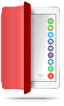
Visitors should know whether the button opens WhatsApp, Telegram, or a broader messenger menu. Ambiguous labels lower trust.
3
Protect the mobile layout
The button must not cover sticky CTAs, cookie notices, booking tools, or the form submit area. Lead gain disappears when the layout fights back.
Three common ways messenger buttons affect lead quality
Messenger buttons vs contact forms vs live chat
| Decision point | Messenger buttons | Contact form | Full live chat |
|---|---|---|---|
| Best for | Fast first questions and low-friction lead entry. | Detailed requests, briefs, and structured qualification. | Ongoing support or team-based chat workflows. |
| User effort | Low. | Medium to high. | Medium, with more interface complexity. |
| Setup weight | Usually light. | Usually already present on the site. | Usually heavier. |
| Small business fit | Often strong when speed matters most. | Still important as a fallback. | Best only when you truly need broader support tooling. |
Handling the main objection: what if visitors still want a form?
Common mistakes
Treating every page the same
A button that helps on a pricing page may be unnecessary or distracting on a long application page. Match the lead path to page intent.
Showing too many channels
Choice overload is real. If the visitor has to compare five apps, you slowed the lead path instead of speeding it up.
Using vague CTA copy
“Contact us” is weaker than a label that tells the visitor what happens next, such as a fast message or instant chat route.
Skipping mobile testing
The lead lift usually depends on mobile behavior. If the button overlaps key UI, visitors leave before the first message starts.
- Choose one primary lead action for the button.
- Place it on high-intent pages, not only the contact page.
- Limit the number of channels to what your audience actually uses.
- Keep the contact form as backup for detailed requests.
- Test button visibility and overlap on a real phone.
Frequently asked questions about website leads with messenger buttons
Can website leads with messenger buttons really increase for a small business?
Usually yes. Messenger buttons can increase first-contact volume because they give visitors a faster way to ask a question before leaving the page.
Can I add messenger buttons without coding?
Yes. Most small business websites can do this with one hosted script, snippet field, or custom code area.
Will messenger buttons work on mobile and desktop?
Yes, if you test both layouts. The button should stay easy to tap on mobile and should never cover sticky actions or forms.
Should I use a plugin, app, or script for messenger buttons?
Use the lightest option your platform supports. A script is often easier to manage, while plugins or apps make sense when the platform strongly prefers them.
Are messenger buttons better than a contact form for leads?
Messenger buttons are usually better for fast first contact. Contact forms are better for structured detail. Many small businesses should keep both.
How many messenger buttons should a small business show?
Usually one to three. More than that can create hesitation and lower the chance of a click.
Need a faster path from page visit to first message?
Launch a messenger button that matches your real lead flow, keep the contact path clear, and give visitors one obvious way to start the conversation.