
LIGHTWEIGHT MESSENGER WIDGET FOR WEBSITE OWNERS

A faster contact layer without the heavy live chat feel

A lightweight messenger widget is usually a small script-based contact launcher that helps website owners add one clean messaging path without plugin bloat, a bulky support desk UI, or a long setup process.

This approach fits small businesses, freelancers, agencies, and lean ecommerce teams that want faster first conversations, cleaner page UX, and a widget that stays simple for both visitors and the people answering messages.
Lightweight messenger widget shown on a clean business website
Lightweight messenger widget preview with simple contact choices

WHY WEBSITE OWNERS LOOK FOR A LIGHTER WIDGET

because most business websites need quicker contact, not a heavier support stack

A lightweight messenger widget keeps the first contact step visible without turning the page into a crowded chat product. Visitors get one clear path to message you, while your site keeps its own layout, CTA hierarchy, and sales flow.

If you want the broader setup path first, read How to add messenger buttons to a website. If you are comparing widget behavior across the page, continue with the floating chat widget guide.

NO-CODE SETUP
Yes, you can add a lightweight messenger widget without coding
Code snippet for a lightweight messenger widget
one small script is usually enough

That is the main reason lightweight widgets appeal to website owners. You can keep the messenger layer separate from the main site build, control changes centrally, and avoid adding another plugin unless your platform really requires one.

Simple messenger widget options inside one lightweight launcher
STEP BY STEP

How to launch a lightweight messenger widget

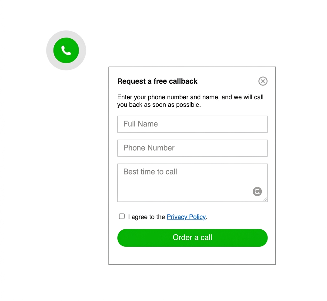
  1. Decide the main contact outcome you want, such as quick pre-sales messages, appointment questions, or simple lead capture.
  2. Choose a widget that adds with one script and does not force a full live chat or support workflow.
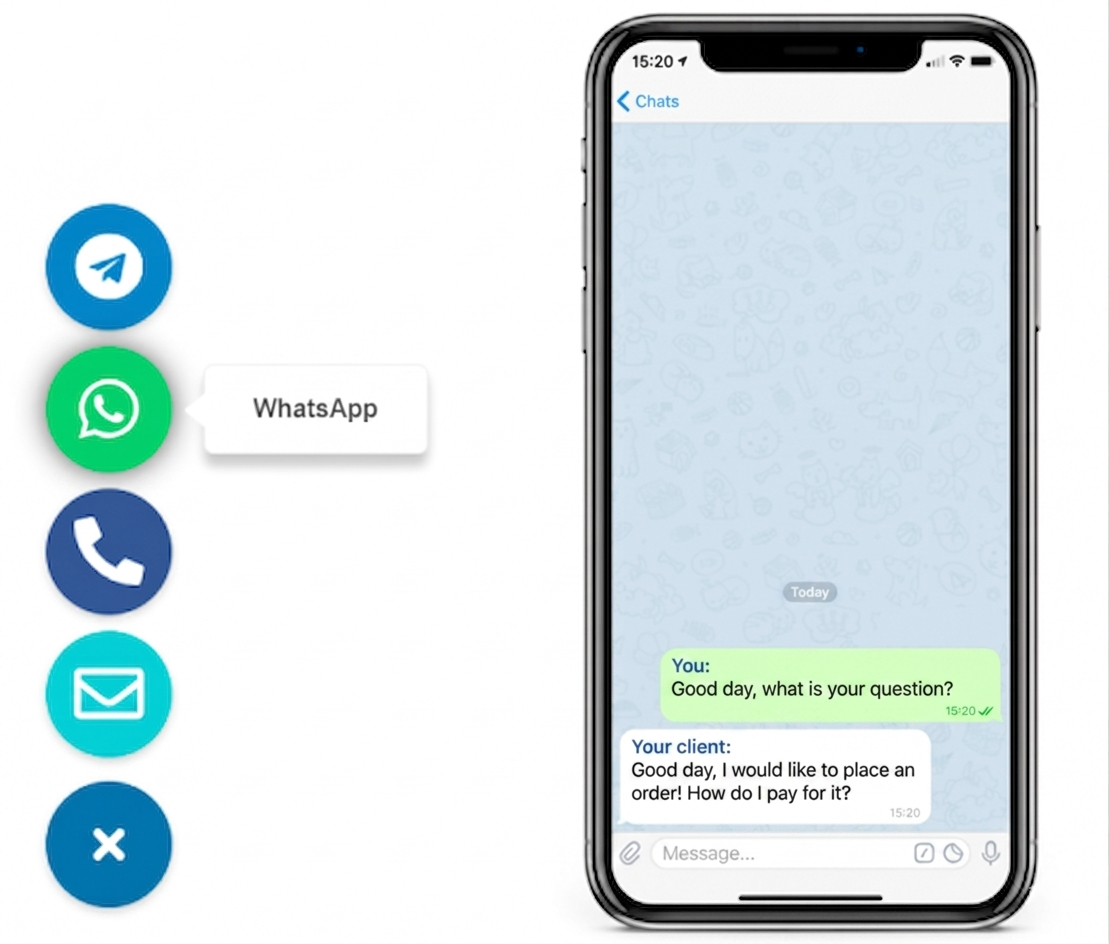
  3. Keep the contact options tight, usually one primary route and at most one or two secondary choices.
  4. Place the widget on high-intent pages first, especially the homepage, service pages, pricing pages, and contact page.
  5. Test tap spacing, overlap, and open behavior on a real phone and desktop browser before full rollout.
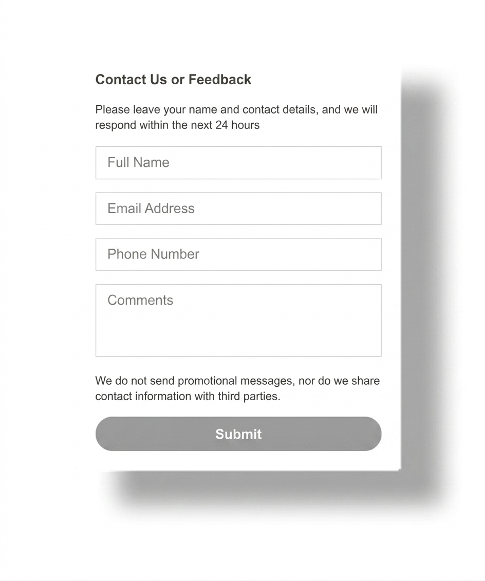
  6. Keep a fallback contact form for longer requests that need more detail.
Fast launch icon for a lightweight messenger widget

Fast to launch

A lightweight widget should go live in one editing session, not become another technical project.
Placement icon for a website owner messenger widget

Easy to place

The widget should stay visible without covering core CTA buttons, sticky bars, or forms.
Mobile-ready icon for a lightweight messenger widget

Mobile-friendly

Many first clicks happen on mobile, so the button size and bottom spacing have to work there first.
Low-overhead icon for a lightweight messenger widget

Low overhead

You get a contact layer that is easier to maintain than a plugin-heavy or support-heavy setup.

Platform guidance for lightweight widget setup

Use the lightest insertion method your platform allows. In most cases, that means one global script instead of multiple plugins, duplicate embeds, or per-page manual edits.

WordPress

Prefer a theme-level custom code field or header-footer injection area before adding another plugin.

Shopify

Place the script in theme code or the platform's custom code area so the widget stays consistent across templates.

Wix

Use the site's custom code settings and check mobile spacing because fixed elements can stack quickly.

Webflow

Add the snippet in project custom code or before the closing body tag for broad site coverage.

Joomla

Use the simplest template or custom HTML injection point available instead of layering several extensions.

HTML sites

Insert the script once in the shared footer or template include so every important page gets the same widget.

If your main question is specific to Webflow or plain HTML, compare with Messenger Widget for Webflow and HTML Sites. For more examples and use cases, browse the YourChat blog.

PLACEMENT AND UX

Lightweight only works if the widget feels easy, not intrusive

Keep the launcher visible near the lower edge of the screen, but leave enough space for cookie notices, sticky purchase buttons, and mobile navigation. A cleaner position often matters more than extra channels.
The best pages for first rollout are the homepage, key landing pages, service detail pages, and the contact page. Those are the places where visitors are already close to asking a question.
Placement guidance for a lightweight messenger widget on desktop and mobile

lightweight messenger widget vs full live chat

A lightweight messenger widget is usually the better fit when you want faster first contact, fewer moving parts, and a simpler page experience. Full live chat makes more sense when you need agent routing, ongoing support coverage, or a larger team workflow.

Option 1

LIGHT

fast first contact

Best when website owners want a simple message path, low maintenance, and a launcher that does not overpower the page.

Option 3

CHAT

support workflow

more overhead
Full live chat is better when you need staff coverage, routing, or a support desk process, not just a cleaner first-contact entry point.
COMMON MISTAKES

Do not make a lightweight widget feel heavy

The most common mistake is adding too many channels, too many badges, or too much motion. The widget should shorten the path to contact, not make visitors decide between a crowded set of tools.
  • Do not show channels your team does not actively monitor.
  • Do not let the launcher cover forms, checkout controls, or sticky CTAs.
  • Do not mix several chat plugins and a widget bubble on the same page.
  • Do not skip mobile testing after the final placement decision.
Common lightweight messenger widget mistakes on a website
QUICK CHECKLIST

Before publishing, confirm the widget stays light in both setup and visitor experience.

  • One main contact action is obvious
  • No unnecessary plugin or app added
  • Homepage and high-intent pages covered first
  • Mobile spacing tested on a real phone
  • Fallback form kept for detailed enquiries

Frequently asked questions about lightweight messenger widgets

What is a lightweight messenger widget?

It is a small script-based contact launcher that helps website owners offer one clear messaging path without a heavy plugin stack or a full live chat interface.

Can I add a lightweight messenger widget without coding?

Yes. Most websites can add one generated script through a footer injection area, theme snippet field, custom code block, or shared template.

Will a lightweight messenger widget work on mobile and desktop?

Yes, as long as you test the final button size, spacing, and overlap on both screen sizes and keep it clear of navigation, forms, and cookie notices.

Should I use a script, plugin, or app for the widget?

Use the lightest option your platform supports. A script is usually the simplest path, while plugins or apps mainly make sense when the platform strongly prefers them.

Is a lightweight messenger widget better than live chat?

Often yes for smaller business websites and sales-led pages. A lightweight widget is easier to launch and maintain when the main goal is faster first contact rather than full support coverage.

How many contact options should a lightweight widget show?

Usually one to three. Too many options can make the widget feel heavy and slow the visitor instead of helping them message you quickly.

Need more examples after this page? Compare with Best Website Messenger Widget for Simple Customer Contact, review What Is a Messenger Widget?, or browse the English blog guides.

A lightweight messenger widget can fit almost any business website

If your platform lets you add one script, custom HTML, or a shared footer snippet, you can usually launch a lighter messenger widget without rebuilding the whole site. That makes it a practical choice for owners who want faster contact with less technical drag.