
WHAT IS A WEBSITE CONTACT WIDGET?

A practical definition guide for website owners

A website contact widget is a small on-page contact element that stays visible while visitors browse and gives them a faster way to message you, open a chat path, or reach the right contact option without hunting through the page.

This guide explains what a website contact widget is, who it suits, how it works, and how to launch one without turning your website into a messy stack of buttons and forms.
Example of a website contact widget on a business website
Website contact widget entry point for a visitor

WHY THIS MATTERS

it reduces friction at the exact moment a visitor is ready to reach out

Many websites still hide contact options in the header, footer, or a separate contact page. A website contact widget keeps one clear contact path visible while the visitor is comparing services, checking prices, or deciding whether to ask a question.

If you want related reading after this definition, compare with What Is a Messenger Widget for a Website? or the more setup-focused messenger buttons guide.

NO-CODE SETUP
You can add a contact widget without rebuilding the website
Simple code snippet for a website contact widget
one shared script is often enough

On many platforms, a contact widget is added through one script or snippet placed in a footer injection field, custom code section, or shared template. That is why it often fits no-code or low-code teams better than rebuilding page layouts by hand.

One contact widget opening several contact choices
STEP BY STEP

How a website contact widget is usually set up

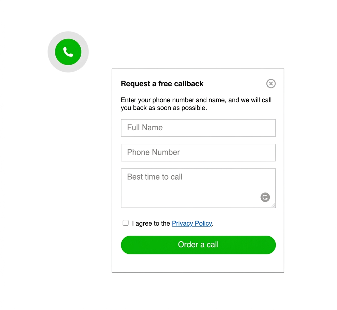
  1. Choose the main contact path you want visitors to use first.
  2. Decide whether the widget should open one contact method or a short list of options.
  3. Add the widget script once at site or template level.
  4. Place it where it stays visible but does not block forms, CTA buttons, or consent prompts.
  5. Test the widget on desktop and on a real phone.
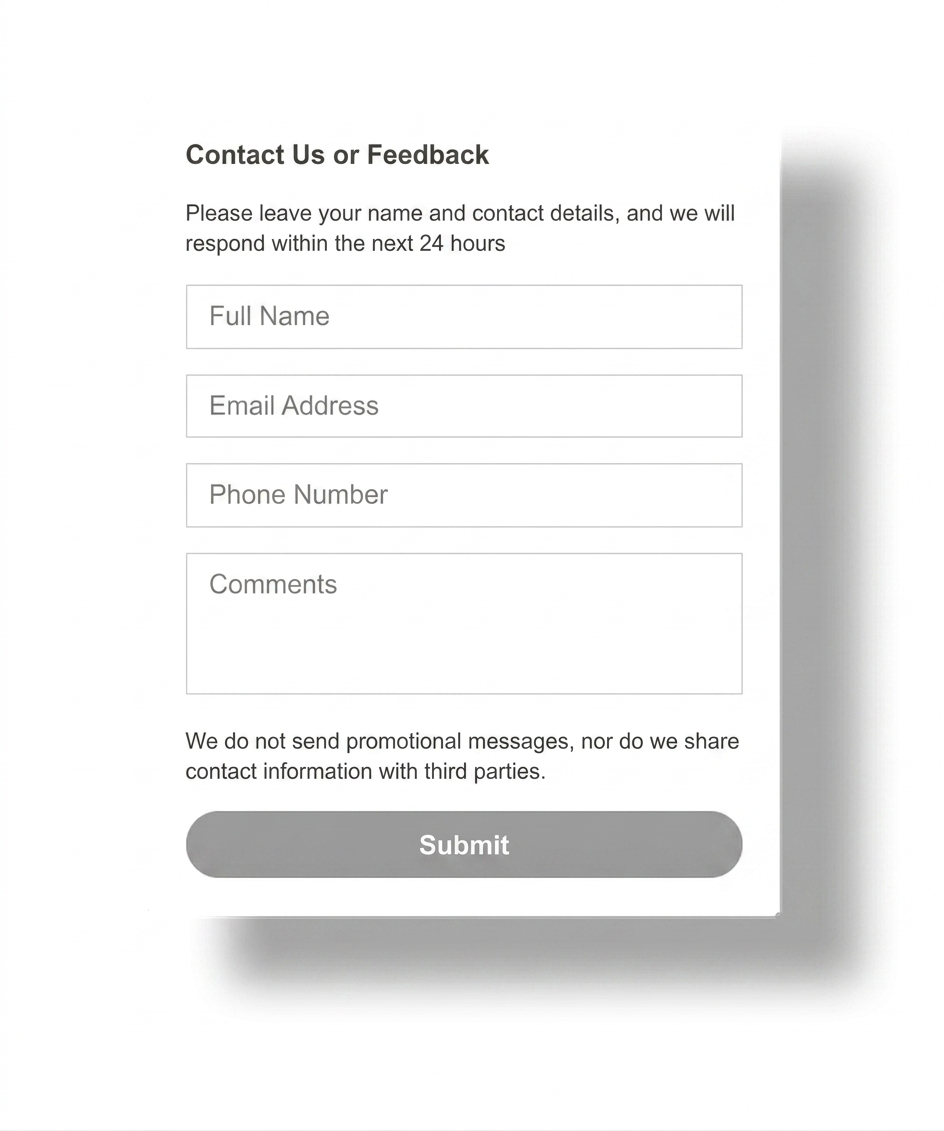
  6. Keep a fallback path such as a contact form for long or structured requests.
Fast launch icon for contact widget setup

Quick to publish

A contact widget should be simple to launch across your main pages, not a long rebuild project.
Placement icon for a website contact widget

Visible but calm

The widget should stay visible without competing with the page's primary conversion elements.
Mobile friendly icon for a contact widget

Mobile ready

A contact widget only helps if it remains easy to tap and does not cover critical content on a small screen.
Platform compatibility icon for a contact widget

Platform safe

A lightweight widget is easier to maintain across WordPress, Shopify, Wix, Webflow, Joomla, and plain HTML sites.

Platform guidance for common website platforms

The meaning of a website contact widget stays the same across platforms, but the installation path changes depending on how your website is edited.

WordPress: a script or snippet field is often cleaner than stacking several separate contact plugins.

Shopify: keep the widget light so it does not compete with product CTAs, sticky add-to-cart bars, or checkout actions.

Wix: confirm mobile spacing so the widget does not cover a booking form, quote button, or section anchor navigation.

Webflow: a global script placement is usually the easiest way to keep behavior consistent across landing pages.

Joomla and HTML sites: template-level insertion usually keeps the widget more stable than page-by-page edits.

Platform checklist
  • WordPress: avoid stacking overlapping contact or chat plugins.
  • Shopify: check cart and product pages first.
  • Wix: review spacing around forms on mobile.
  • Webflow: test the shared script on published pages.
  • Joomla and HTML: place the script once in the shared template.
  • All platforms: verify behavior on a real phone.
Related reading

Need a platform-specific example? Read Messenger Widget for Webflow and HTML Sites, compare with the WhatsApp setup guide, or browse more examples in the YourChat blog.

PLACEMENT AND UX GUIDANCE

A contact widget should help the page, not interrupt it

For most business websites, the best default placement is a floating launcher in the lower corner. The key is keeping it visible without hiding forms, pricing CTA buttons, sticky menus, or legal notices.

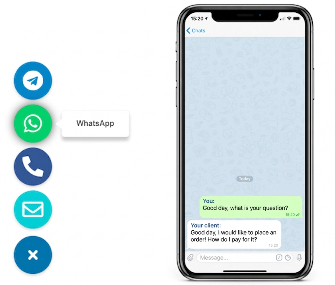
If the widget opens several contact options, keep the first view short and obvious. If you mainly need one messaging route, compare this article with the WhatsApp button setup guide or Telegram Button for Website.

Website contact widget shown on a phone screen

WHAT IT TYPICALLY INCLUDES

Most website contact widgets combine three simple ideas
They give the visitor one obvious launcher, open one channel or a short list of contact options, and stay available across the site without forcing the visitor to restart the page journey.

1

VISIBLE LAUNCHER

2

REAL CONTACT PATHS

3

CROSS-PAGE ACCESS
Website contact widget layout with clear floating placement
Keep the first click obvious

contact widget vs contact form vs live chat

THREE CONTACT APPROACHES, THREE DIFFERENT JOBS

Option 1

FORM

structured request

A contact form works best when visitors need to send detailed project information, files, availability requirements, or a longer service brief.
best for longer submissions

Option 3

CHAT

heavier workflow

more overhead
Live chat makes sense when a team needs active support handling, staffing coverage, or a larger service process that goes beyond simple first contact.

Can you use a website contact widget without coding?

Usually yes. If your platform supports a custom code field, footer injection area, HTML block, or shared template, you can often add the widget without custom development.
That is why contact widgets are common on service sites, local business pages, simple ecommerce setups, and landing pages where the main goal is quick first contact.
COMMON MISTAKES

The widget should not become a crowded contact menu

A website contact widget is supposed to reduce friction. It stops helping when it opens too many channels, overlaps your page CTA, or asks the visitor to choose between too many similar contact actions.
Keep the primary action obvious. Leave long project intake, support routing, or detailed qualification to other parts of the site when needed.
Website contact widget shown next to a clean contact flow
Website contact routes next to a contact widget
CHECK BEFORE YOU PUBLISH

Quick checklist for a useful contact widget

  • One clear primary contact action
  • No overlap with forms, sticky bars, or cookie banners
  • Easy tap target on mobile
  • Only real channels your team actually monitors
  • Fallback path for detailed requests
  • Tested on homepage and high-intent pages
QUICK CHECKLIST

Before you call it finished, confirm the widget supports the contact journey you actually want.

  • The first click is obvious
  • The widget stays visible on key pages
  • Mobile spacing is clean
  • You are not offering dead or unmonitored contact options
  • The contact form still exists for long requests
  • The setup is easy for your team to maintain

Frequently asked questions about website contact widgets

What is a website contact widget?

A website contact widget is a small on-page contact element that stays visible while visitors browse and helps them start a message or choose the right contact path without searching the page manually.

Can I add a website contact widget without coding?

Yes. Many websites can add a contact widget with one script or snippet placed in a custom code field, footer injection area, or shared template.

Will a website contact widget work on mobile and desktop?

Yes, if placement is handled carefully. It should stay easy to tap on mobile, remain visible on desktop, and avoid covering forms, menus, or cookie notices.

Should I use a plugin, app, or script for a website contact widget?

Use the lightest option your platform supports. A script-based setup is often easiest to maintain, while plugins or apps can be useful when the platform strongly prefers them.

Is a website contact widget better than a contact form?

It is usually better for fast first contact. A contact form still works better for long structured requests, quote details, and enquiries that need several fields.

Should a website contact widget show one channel or several?

Usually one clear primary path and only a short list of alternatives. Too many choices make the widget feel crowded and can slow the visitor instead of helping them act.

Need deeper examples after this definition? Browse the English blog guides, compare with the messenger widget definition guide, or review the WhatsApp setup article.

Need a simple contact widget for your website?

If you want one clean floating contact path instead of scattered buttons and buried contact details, create a widget that fits your real pages and launch it across the site with a lighter setup.